Tuesday, June 4, 2024
Composition in a Nutshell...
In any creative expression, be it woodworking, music, painting, sculpture or photography, the more adept you become with the tools of the trade, the better you can express your creative side. Michelangelo was talented, yes, but he also knew how to mix paint, chip rock and sharpen his chisels. He also understood composition. 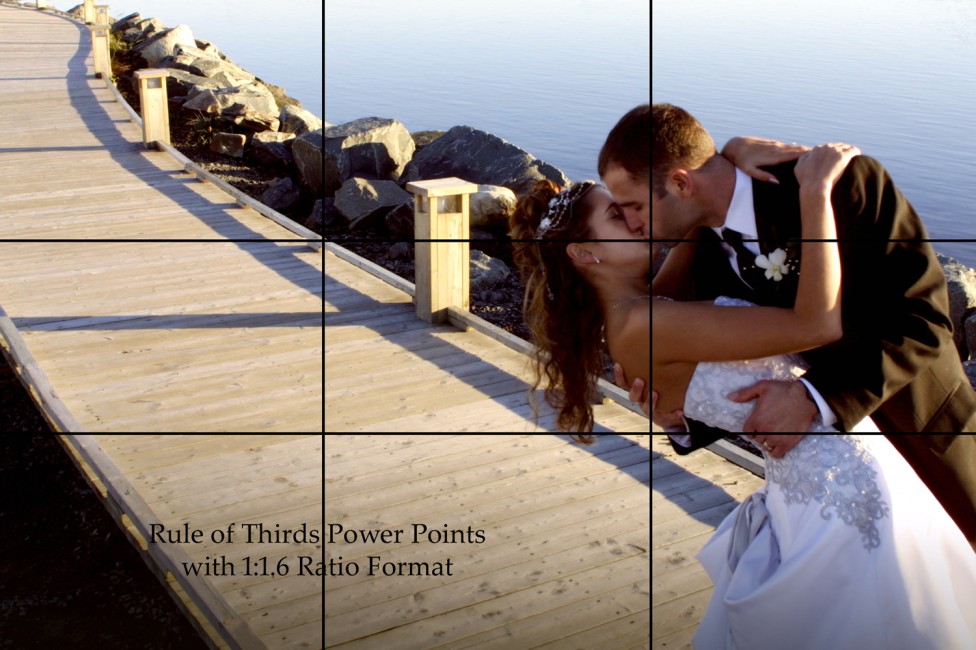
Composition is simply the arrangement of elements within a given area. For effective visual presentation, there are principles that when understood produce exciting images very consistently. Keep in mind that these are only guidelines to provide a starting point for your own visual expression. Personal creativity will warrant changing or ignoring some of these guidelines from time to time, so these should be seen as instructional tips on where to begin to create an image, rather than hard and fast rules. However, choosing to ignore is different from not knowing.
The Primary Subject
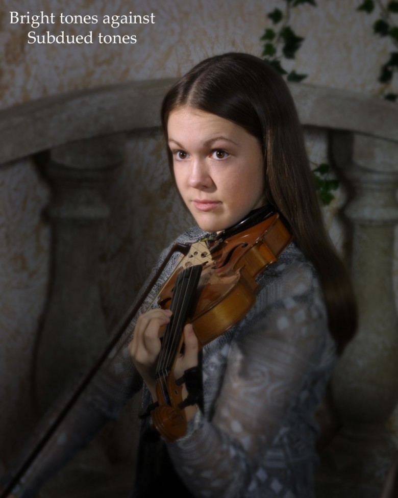
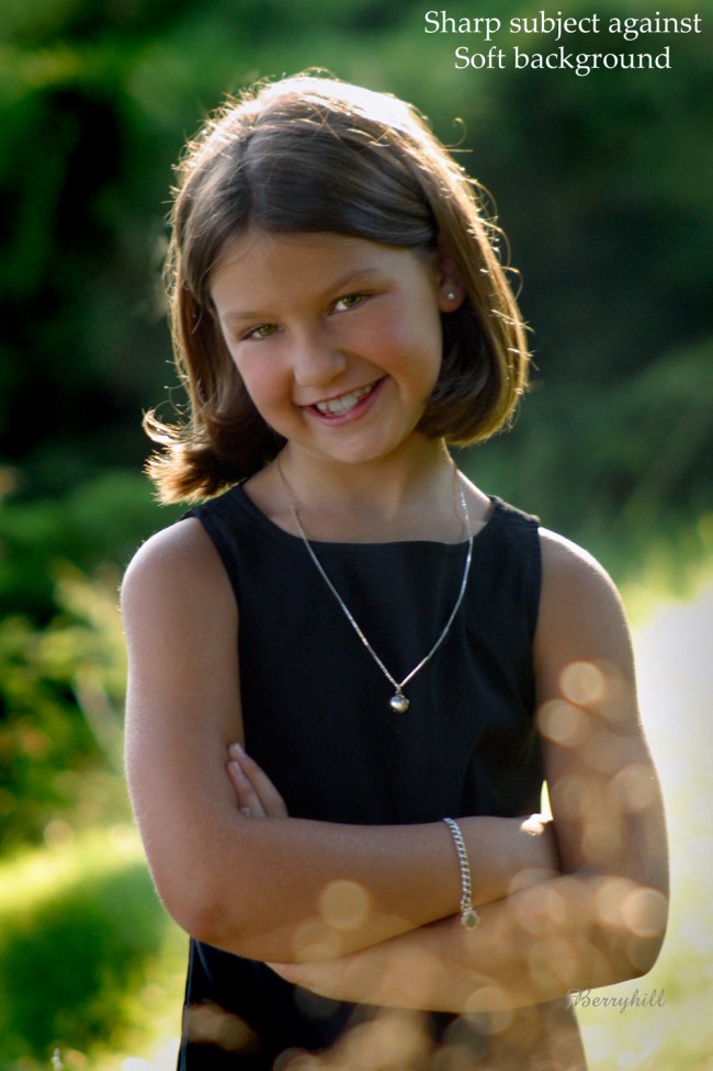
In most images there should only be one primary subject. You can create the main subject in a number of ways. Make it the sharpest, or lightest, or brightest, or biggest, or the most recognizable or understandable element in your image. To do this, utilize one or more techniques. Place light against dark (#1), or dark against light (#2). Place warm against cold tones (#3), or bright against subdued hues (#4). Sharp objects against soft backgrounds will also help create the primary subject (#5).
Primary Subject Placement
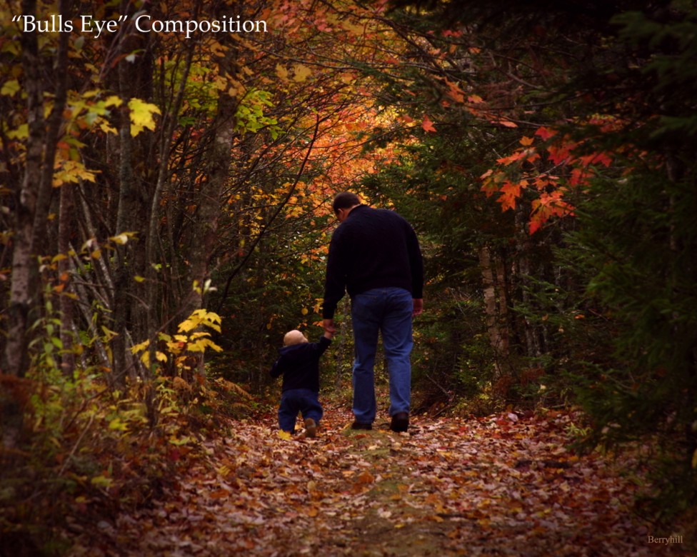
Where you place the primary subject will draw attention to it if done properly. There are several key points within a composition that naturally draw the viewer’s eye. First is the centre of the composition, using what is referred to as "Bull’s-eye" composition (#6). This is actually a weak point for subject placement unless the subject matter is quite dramatic in the first place. The most common guideline, although misunderstood by many, is the Rule of Thirds. This refers to the principle of dividing the picture area into thirds both horizontally and vertically, and placing the primary subject on the points where these imaginary lines cross (#7).
In truth, this principle works best only when the entire picture area achieves a ratio of 1:1.6, creating what the Greeks referred to as the Golden Rectangle. To obtain a rectangle where the rule of thirds applies, multiply the shorter side of your print by 1.6 to get the longer dimension. For example, 5 x 1.6 = 8, so a 5 x 8 rectangle will divide properly into thirds for the composition. Here's a tip - add 5 and 8, equaling 13, and you will find that an 8 x 13 rectangle has the same proportions as the 5 x 8, and so on with a 13 x 21, 21 x 34, etc. This series - 3, 5, 8, 13, 21, 34, etc. is called the Fibonacci series, after the Italian mathematician who first described it.
Unfortunately, we are stuck with the common ratio of 8 x 10, or 16 x 20, to make many of our images with. This, I have been told, is because in the early days of American photography, glass plates were used in cameras, demanding that photographers had a ready supply of glass available for their wet plate images. Houses of the day had windows comprised of 8 x 10 panes of glass, and therefore hardware stores carried glass in that size as a regular item. Eastman Kodak realized that fact, and produced paper and cameras based on commercial rather than artistic criteria.
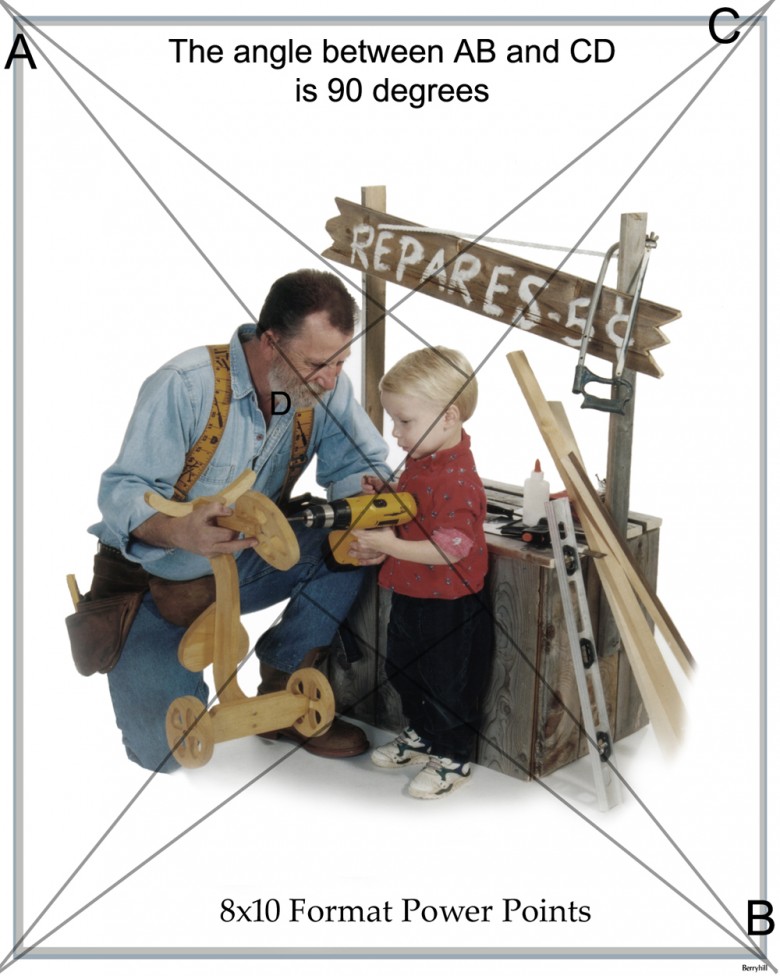
To determine on an 8 x 10 format the best place for the primary subject placement, draw an imaginary line diagonally through the rectangle. Then draw another line perpendicular to the first, from the opposite corner. This second line will intersect the first slightly off centre, indicating the best visual anchoring point for your principle subject (#8).
The last and most creative place for the principle subject to be placed is where you want the viewer to look. To draw the viewers’ eye to the principle subject, you can employ either tangible or intangible "leading lines" as subtle guides for the eye to follow.
Lines of Composition
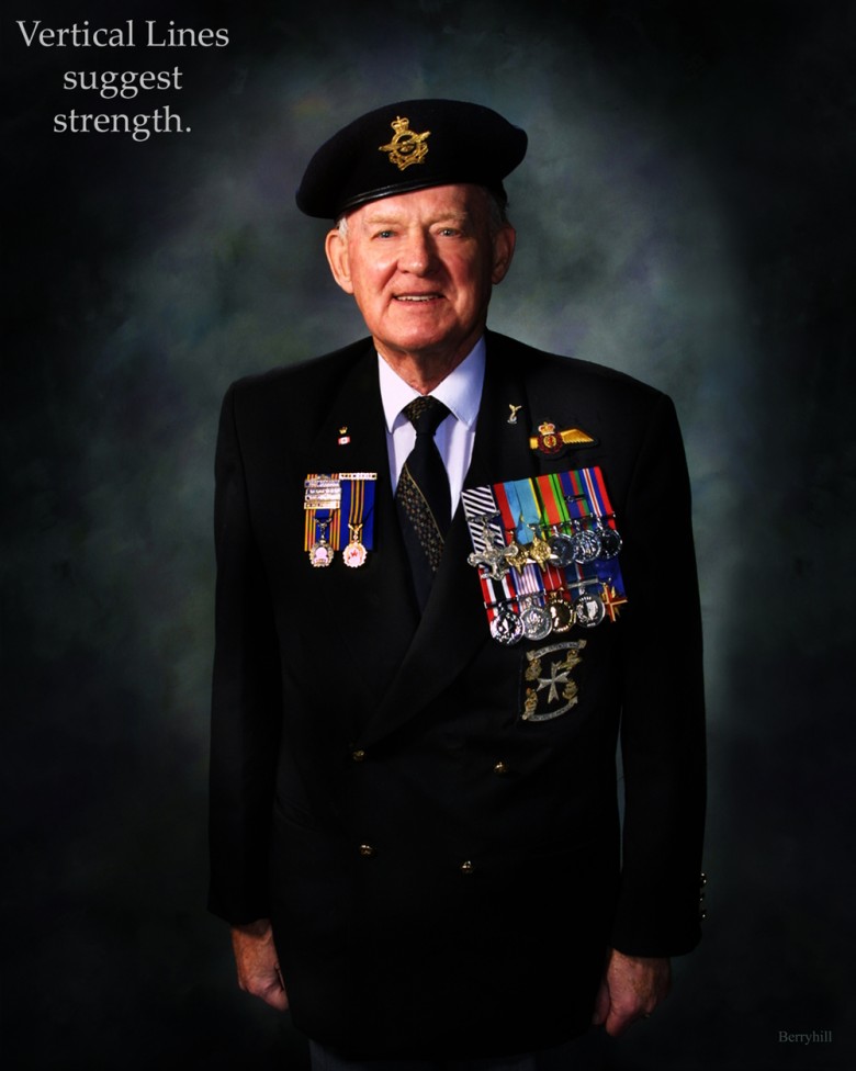
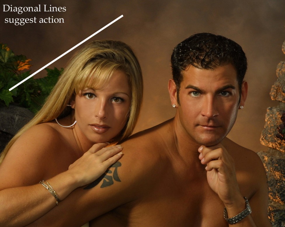
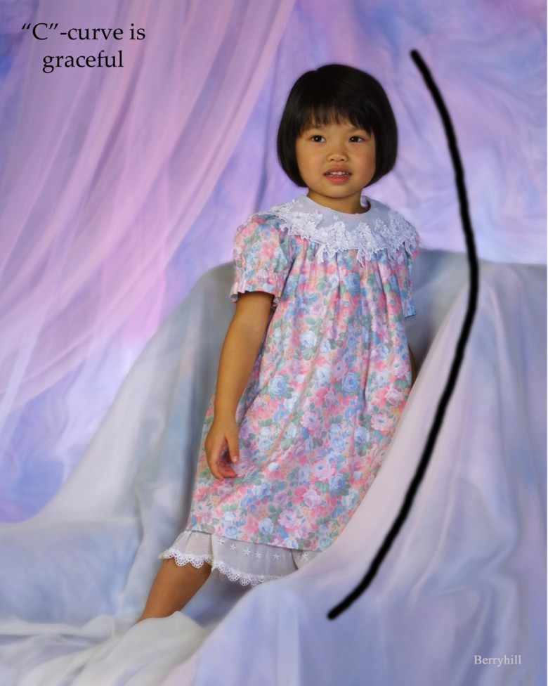
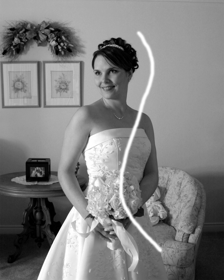
Lines of composition take many forms, but each creates its own feeling through our emotional reaction to its psychological message. Vertical lines of composition (#9), create a soldierly, regal or formal feeling. Horizontal lines (#10), suggest rest, tranquility, dormancy or even death. Diagonal lines (#11), suggest action, direction, or movement, with the intensity of the reaction dependent on the angle of the diagonal. A curved line (#12), is a more gentle way to direct a viewer’s eye, while an “S-curve” (#13) is even more graceful and feminine.

Shapes and Their Effect
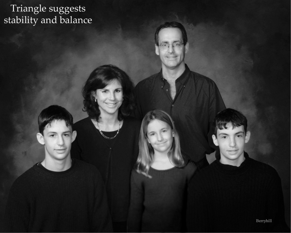
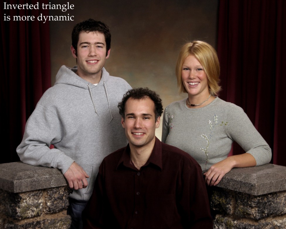
While on the topic of shapes, arranging the elements of a photograph in a triangular pattern (#14), suggests stability, solidarity and balance. When the triangular composition is inverted (#15), the opposite effect is achieved. The composition becomes unstable, creating dynamic tension. Rectangular or square arrangements of subjects are static, over-structured, simplistic and visually boring in most cases. Arranging subjects in an oval or circle (#16), creates a sense of unity and femininity in the viewer, and also holds the viewers attention within its shape...
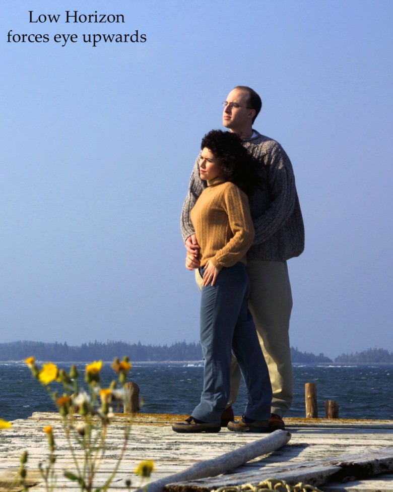
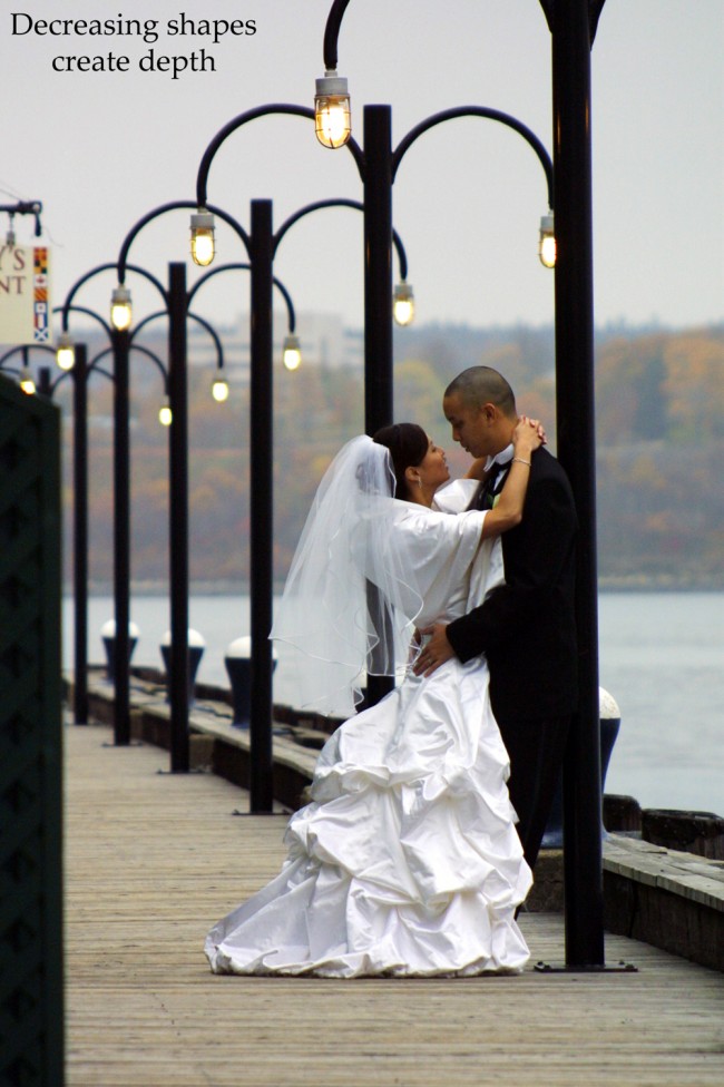
The horizon line in your composition should seldom dissect your image in half. Lowering the horizon line (#17), gives a feeling of increased space, forces the eye upwards, and gives extra attention to details in the distance. A higher horizon line (#18), is more intimate, drawing the eye downwards and bringing the background forward. Even greater spatial depth can be achieved by repeating similar shapes in decreasing size (#19), to suggest the third dimension in your image.


Creating the Visual Feast
“A little of this, a little of that…”
In the first part of this article I gave pointers on how to create the primary subject in a composition, where to place it in your image, and how to draw the viewer’s eye to it. The lines and shapes used in composition equate to the pots and pans that a chef needs when asked to prepare a meal. Every talented chef also has cupboards full of spices, herbs, and other ingredients that they use with varying degrees of skill and artistry to create dishes that stimulate and excite the taste buds. How they combine them, the quantity, mixture, and their own sense of taste will dictate the final feast.
Ingredients
In photography, the primary subject is the main ingredient, but without the right combination of other ingredients, the resulting preparation will be boring and bland. You will have many different items in your photographic “cupboard”. Some of them are: Choice, Simplicity, Selection, Line, Shape, Balance, Lighting, Tonal range, Contrast, Rhythm, Design, Pattern, Colour, Texture, Timing, Mood, Depth, but most importantly… YOU.
You are the most important ingredient! Success is directly proportional to your determination to exercise your visual muscles, and as in all things, practice and experimentation are mandatory before you feed the public what you have prepared.
Let's explore a few of the ingredients mentioned above in greater detail.
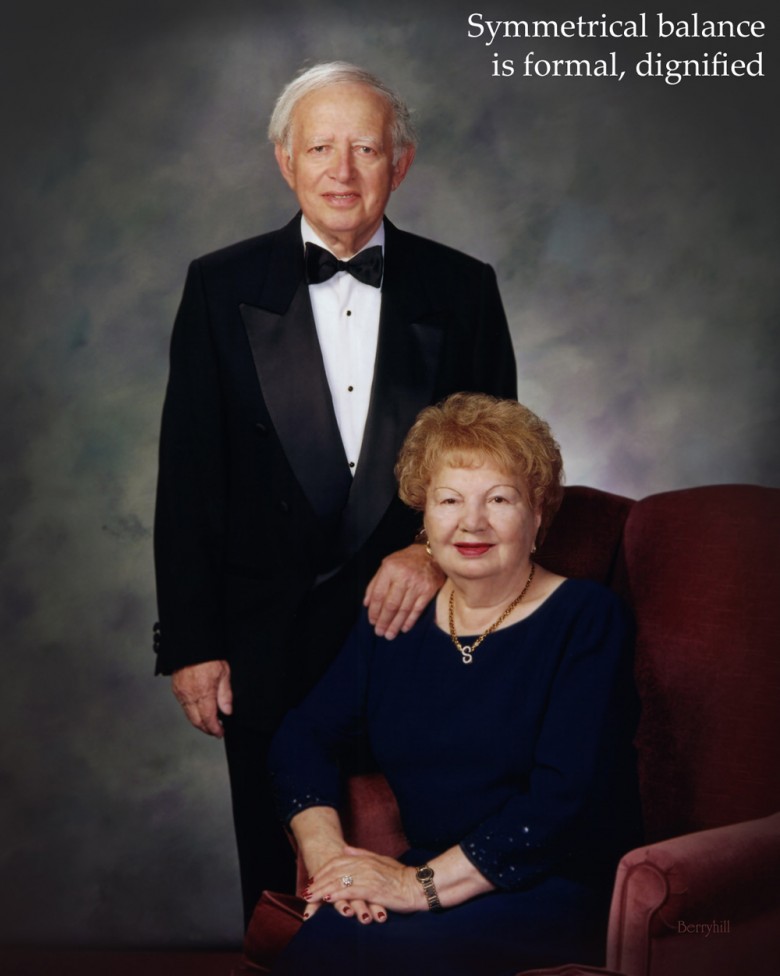
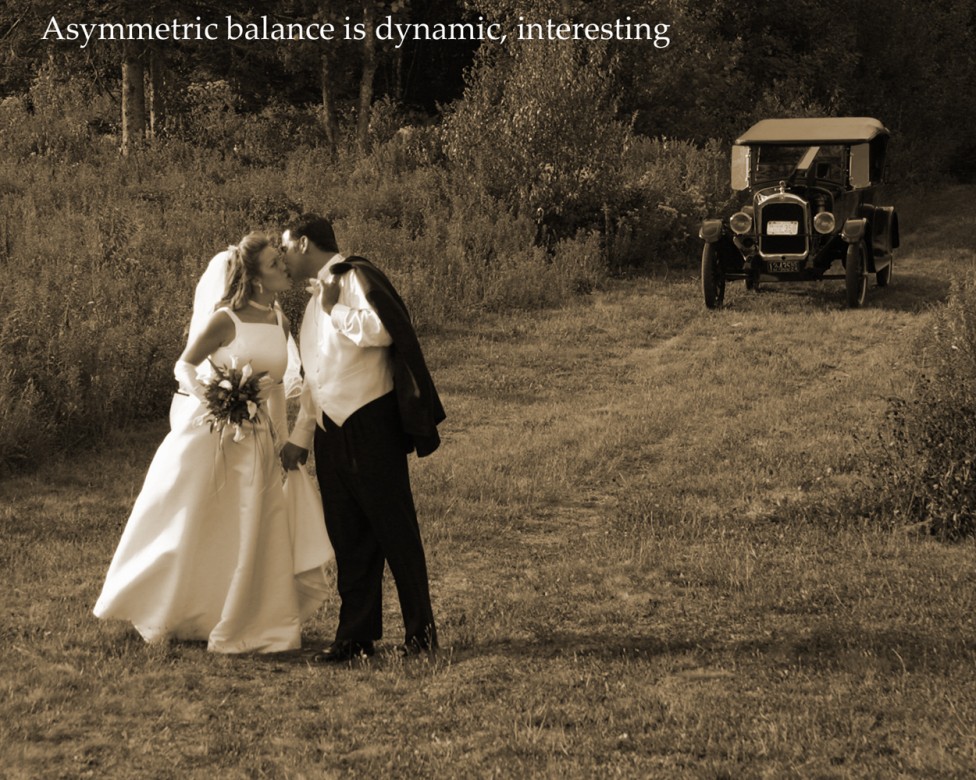
Balance can be either symmetrical or asymmetrical. Symmetry (#20), suggests formality, dignity and conventionality, but can be static and boring as well. Asymmetric balance (#21), having one subject larger and more dominant than another is more dynamic, interesting and natural.
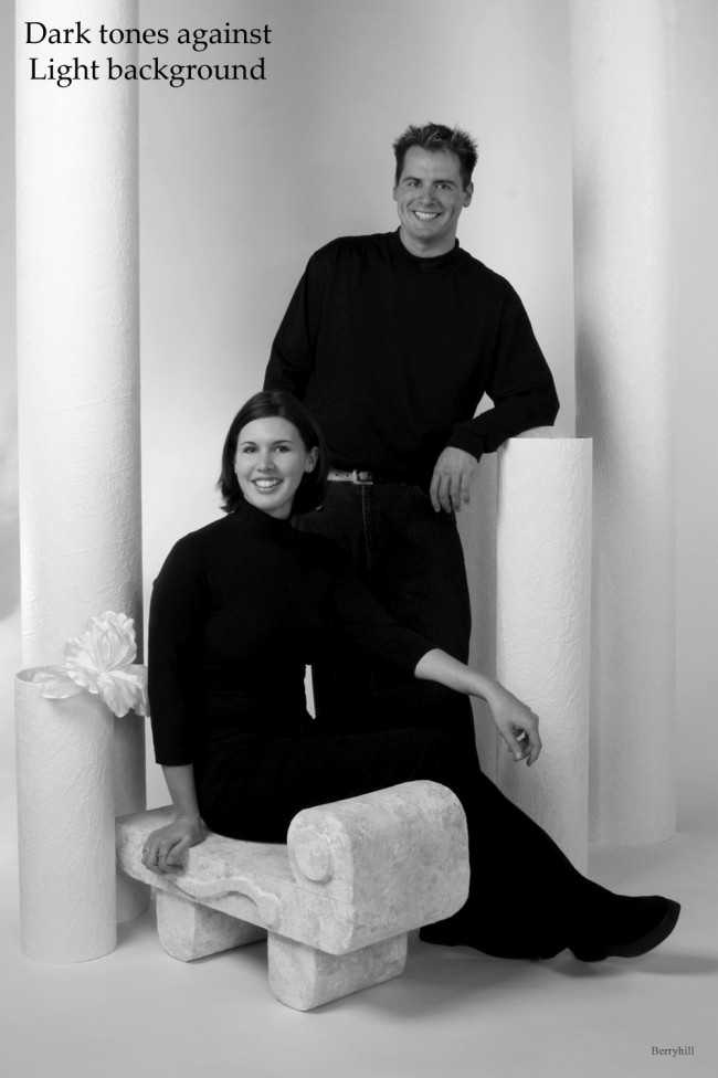
Images with dark tonal values suggest the unknown (#22). They create an air of mystery, power and masculinity, but can hint at night, danger, or even death.
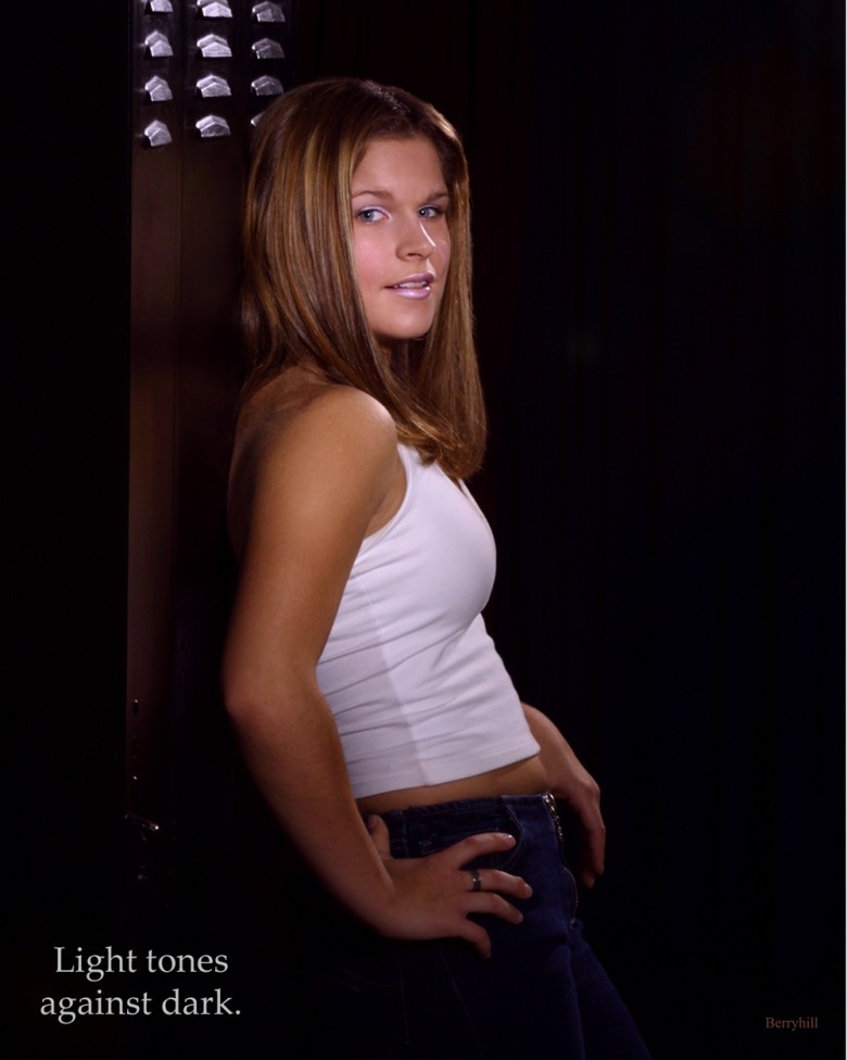
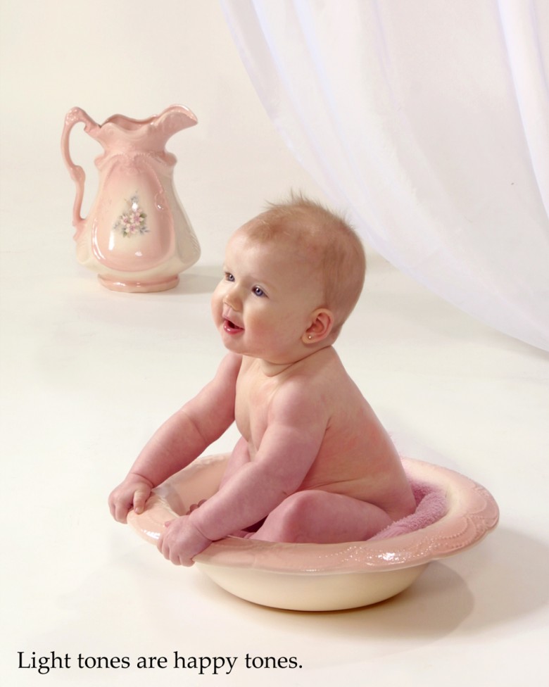
Light tonal values (#23) give an image an air of gaiety, frivolity and sunlight. They produce images filled with delicacy, femininity or youth.
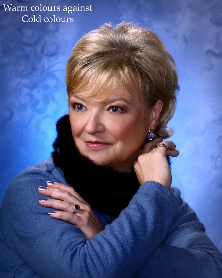
The power of colour lies in its quality of warm versus cold. Warm colours such as red, orange and yellow visually approach the viewer, and attract attention (#24). Cooler colours such as blue, black and violet recede, remaining subordinate to the warmer tones in the image (#25).
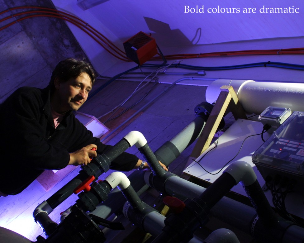
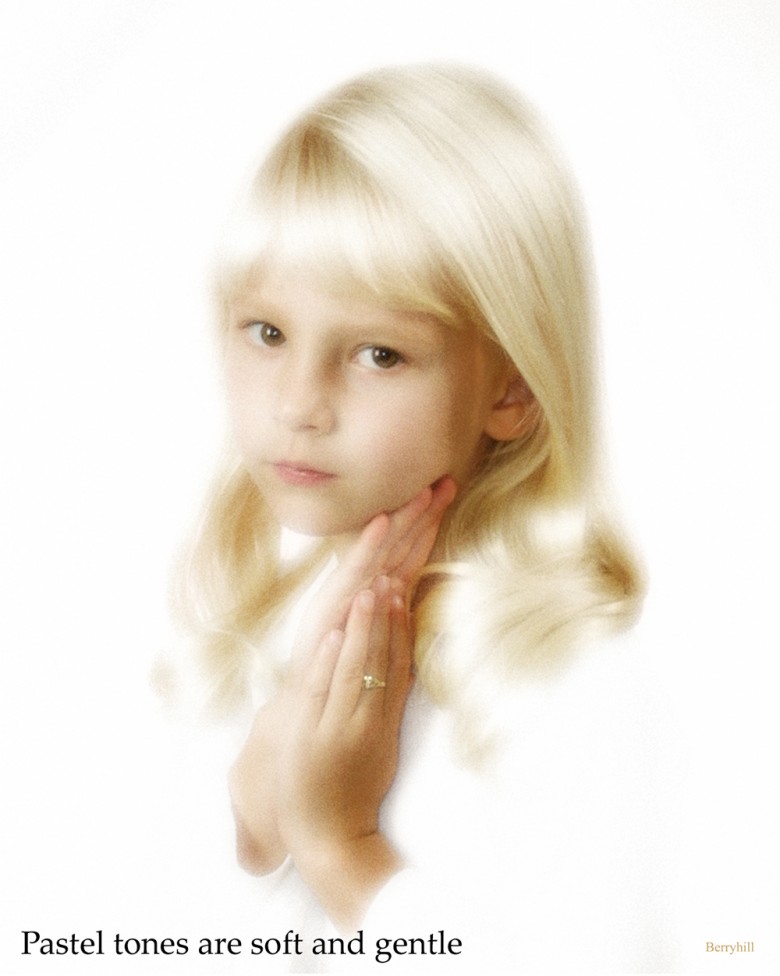
When you have dramatic contrast in the tones or colours in your image (#26), you create something bold, dramatic and exciting for the eye. Use of pastels and low contrast (#27), give a gentler, soothing, more peaceful impression to the viewer.
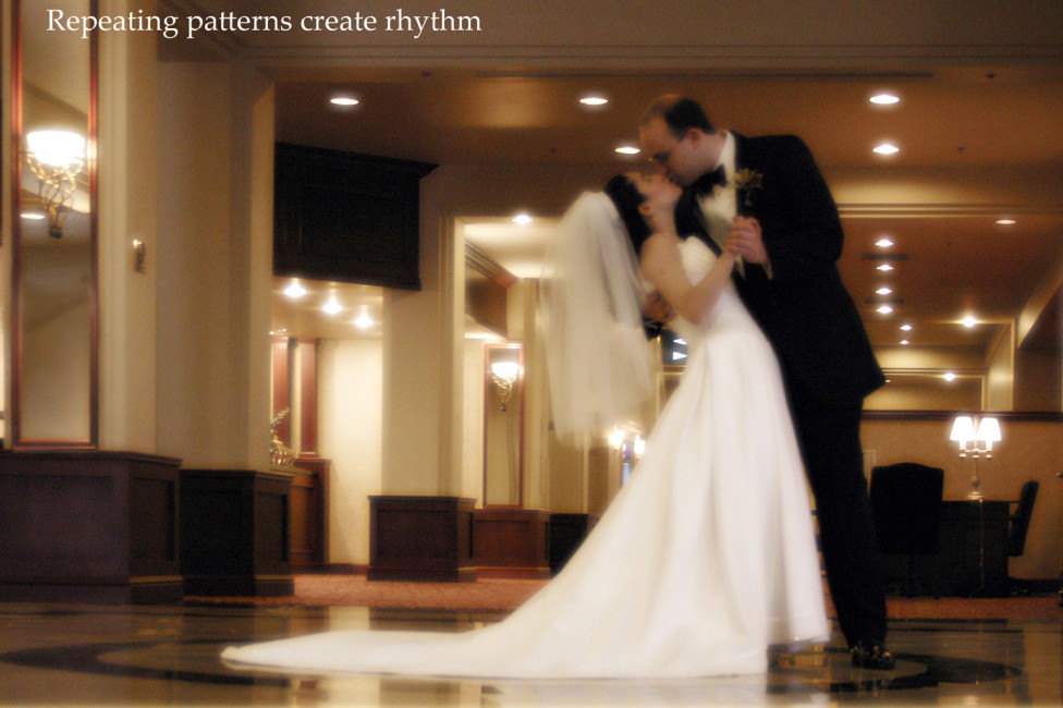
Rhythm in a visual sense is created when you repeat the same pattern within an image (#28), with enough variation in the pattern to make it interesting. Remember to keep to the beat, though.


Creating the Third Dimension
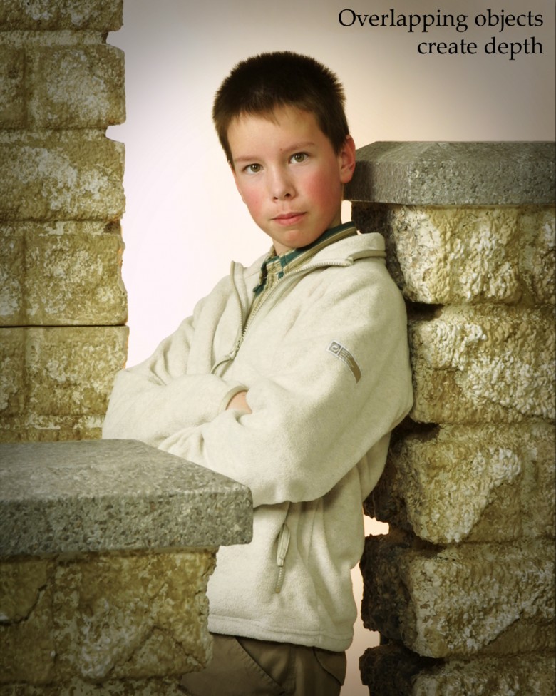
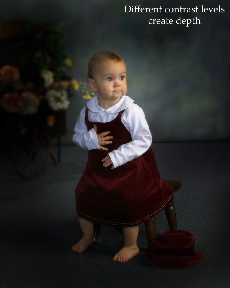
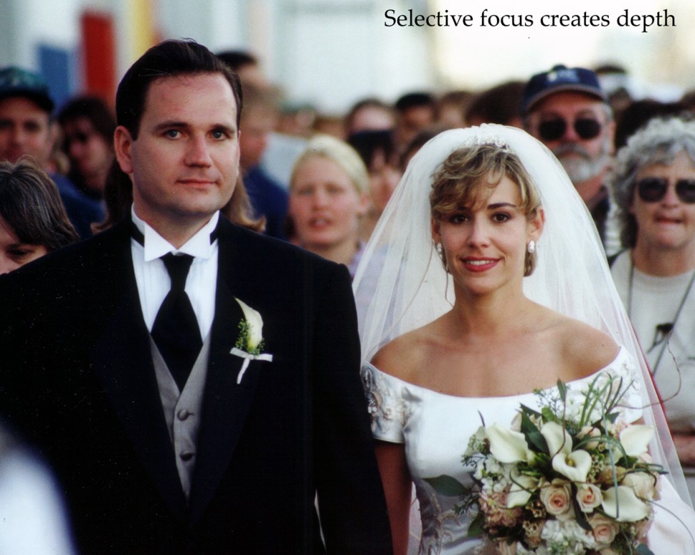
Creating the illusion of depth in an image is always a challenge. There are several guidelines to add depth visually. Placing the main light close to 90 degrees to the camera is the first thing to consider. Overlapping objects front to back (#29), or arranging them to extend into the background are others. Using a camera angle or focal length to achieve diminishing size or to create converging lines of perspective (#30), is another technique to consider, as is utilizing existing diagonal lines in the image to lead into the background. Control of the contrast at different distances from the camera (#31), and the use of selective focus (#32), are yet two more options.
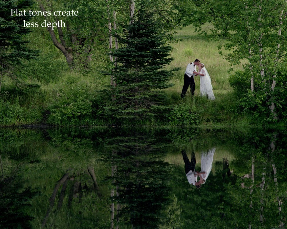
Sometimes you want to decrease apparent depth in an image. In this case you should consider frontal lighting, a fairly strong fill light for a low contrast ratio, no overlapping subjects, increasing the depth of field with a smaller aperture, or using a longer focal length to compress the elements in the image. Arranging all the elements on one plane, reducing contrast or arranging similar tones together will all add to the effect of creating a flatter image (#33).

Remember, classic composition is simple, harmonious, well-proportioned and has a strong centre of interest. There will always be a market for the classic styles in any medium from those who appreciate the talent, understanding and experience it takes to create them. These are your best clients - the aware consumer who understand the words of Confucius when he observed that “Everything has its beauty, but not everyone sees it.I hope these guidelines will aid you in making better use of your visual muscles, and have helped you advance the artistic qualities and overall excitement of your subjects towards their portraits.
Submitted by: Bruce Berry, F/PPOC, MPA, F/MPPA